
Intuit has 4 cornerstone products with separate branding guidelines. Within each product there are hundreds of user flows which use a wide range of selection components. This has caused inconsistency specifically at the front door where the marketing message is ‘One account for everything Intuit‘ but depending on which product you access, the selection experience looks very different.
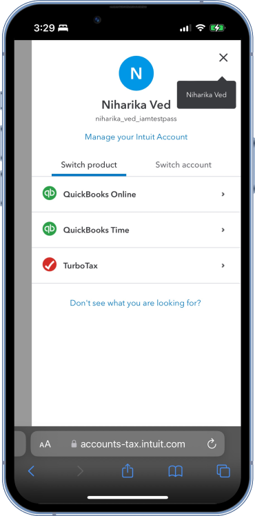
Selection experience for identity includes experiences like user ID selection, sign in factor selection, company selection, etc.
This project was started for a hackathon to create consistency across company selection experiences for all Intuit products but is now the baseline selection experience for Identity and has been successfully contributed back to Intuit Design System for adoption across Intuit experiences.
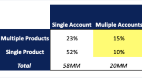
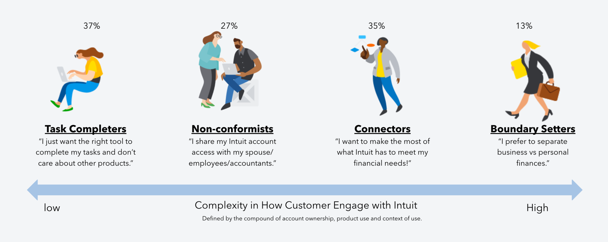
Customers are using more of Intuit
More products
23%* of customers use more than one product, with a growth of 19% in FY19 to 27% in FY20
Multiple devices
22% of customers use a mix of web and native products on mobile and desktop devices
More companies on QB
45% of QBO customers have 2 or more companies
20% (>2M) of QuickBooks customers have multiple accounts
5% (>550K) of QuickBooks customers use their multiple accounts actively
14% (>120K) of QBO Accountant firms have 10 or more clients
More complexity is created undesired friction

“I think I might have eight usernames out there and some are associated with my kids accounts, my sisters.“
Tracy, Accountant using QuickBooks
Select sign in factor
More accounts
25% customers have more than one Intuit account
$5M in care costs
are attributed to customers struggling with multiple accounts
Picker experiences across Intuit products

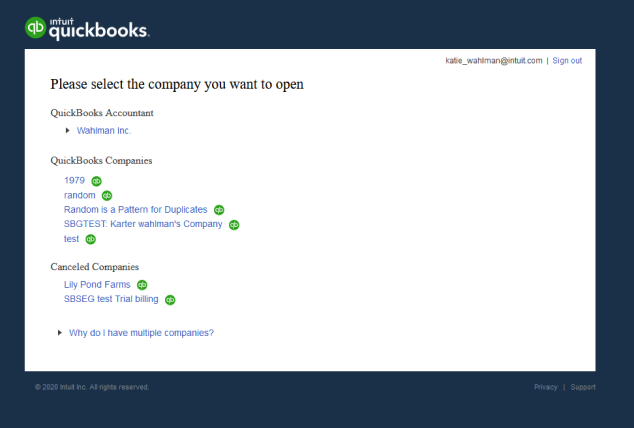
QuickBooks company selection for web
As an Intuit customer, I need to make the right selection between multiple accounts/profiles/products/companies I own or use on different devices and Intuit products, so I can get to the right place to complete my task.
Customer problem statement
Our design principles

Customer centered
We wanted to create components that could scale to fit customer’s situation, needs and known behaviors. Our experience will drive smart picking logic based on repeated use for Intuit customers.
Our success metrics
Do no harm
No negative impact to business KPIs.

Increased sign in speed
Reducing friction for customers, while giving them the choices they need.
Starting with the Picker 1.0 component UI
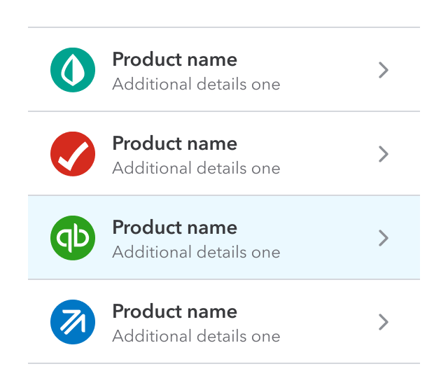
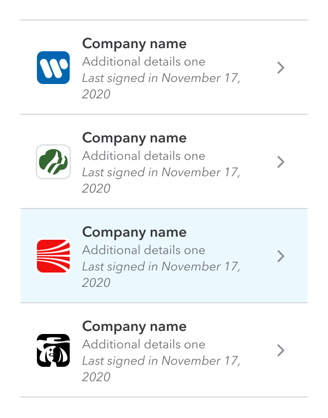


Table UI picker style
Maximum level of metadata detail
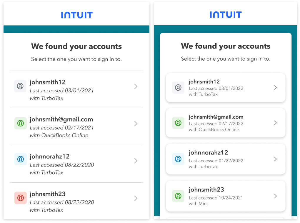

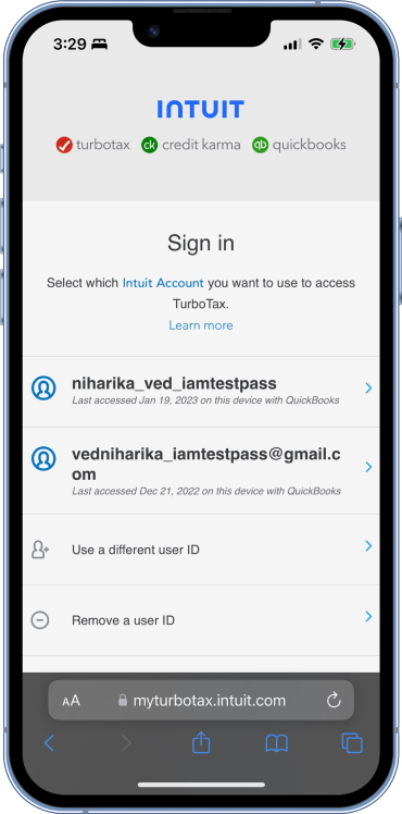
Select user ID
1% lower sign in success rates
for customers who use multiple accounts

Select financial account
Our challenge
Best in class design and UX
Our component has to work with the Intuit Design System while elevating design craft and being on par with UX trends and industry standards.

Reduce clones
Gain widespread business adoption that enables customers to intuitively select what they need no matter where they are in our ecosystem.
Tile UI picker style
Minimum level of metadata detail
Possible variations
Tile component
Pressure testing components across user flows
12% faster product landing post sign in
Duplicate company creation down by 40%
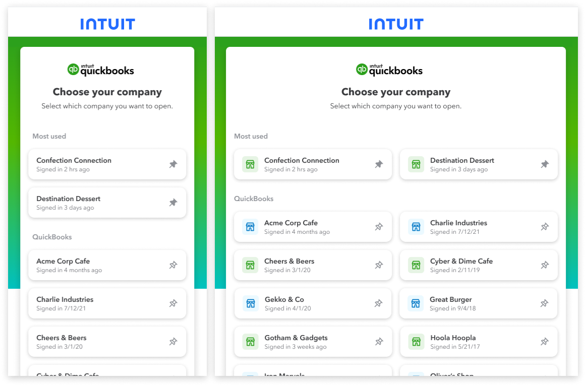
Updates include: account picker, search, pinning favorites and canceled companies
This is a major change in the sign in process and has made consolidation of sign in processes possible for QuickBooks SKUs.
After a TurboTax customer signs in, they will see picker component to select between personal and business taxes.
Wihin business taxes, all available companies are shown with the new picker component.
Total business tax revenue supported by this work for tax year 22 is $2.5M.
Select Intuit product

Consistent experiences across the ecosystem is key
Based on three rounds of user research.
New picker component

Table component

ProConnect company selection for web
As a business, we want to deliver smart authentication platform experiences that get our customers where they need to go as intuitively and effortless as possible, so they can reap the benefits of our products and services.
Business problem statement

How might we combine the power of an ecosystem-driven design system with customer data to deliver smart, intuitive picker experiences that accurately get customers where they need to go?


Scalable and extensible
Our design is based on repeatable and extensible sections which can scale from the most simple to most complex use cases.

Reduce care contact cost
Reduce care costs associated with picker friction (currently $5MM).
No metadata detail
Optimize component for task completer archetype
Based on survey for N = 575 users
Tile format is preferred for better
readability and scannability
Tile design is recommended – scannability, clickability, modern feel.
Expandable tile is intuitive and easy to understand.
Don’t touch my stuff
Customers expect to see companies in alphabetical order and did not like reordering of the list to show personalised solutions.
One column approach is recognizable
Customers prefer one column approach for scanning companies quickly
Use of two column approach for entities >7 was acceptable
More content provides the much needed
context for the customer to succeed
“Last access” preferred over “signed in” — more familiar wording
Extra details make the tile bigger — easier to read and tap
Longer sentence format makes more sense
Hours/days/weeks are easier to read than specific dates
Picker component framework


QuickBooks adopts picker component across all SKUS
TurboTax adopts picker component across personal and business taxes

“The most annoying thing I have to go through is just logging in to the right account. It's like every time I'm logging in, I have to go through this rigmarole and figure out which one it is.”
Perry, Tax advisor
Big takeaways
Design system components are difficult to get right
There are many stakeholders involved in the process and socializing the component and successfully contributing it takes a lot of iterations and reviews.
Not all developers understand contribution framework
The initial component was created for only company selection use cases, we needed to spend extra developer time to justify and create a re-usable component.
AI Integration versus customer data usage
We wanted to create AI based smart picking experience but we have enough customer data to build smart picking without using AI experiences. Currently every team is looking to integrate AI which has bloated timelines, but we were able to achieve smart picking experience based on customer usage patterns.